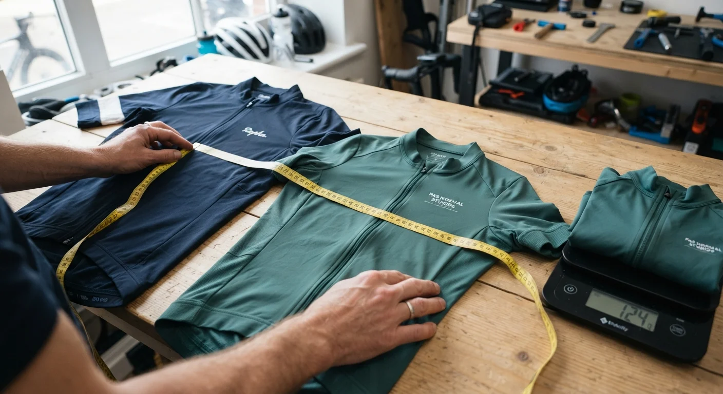
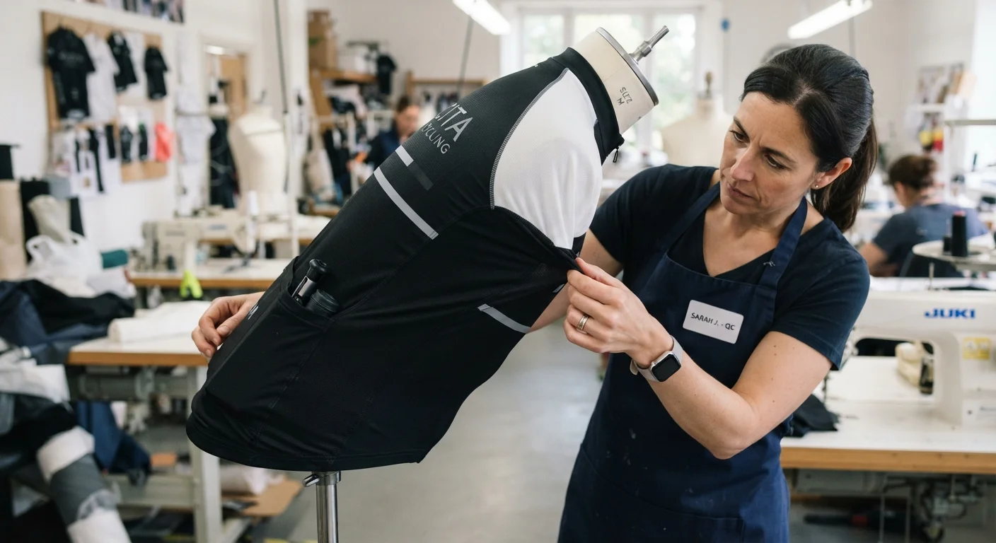
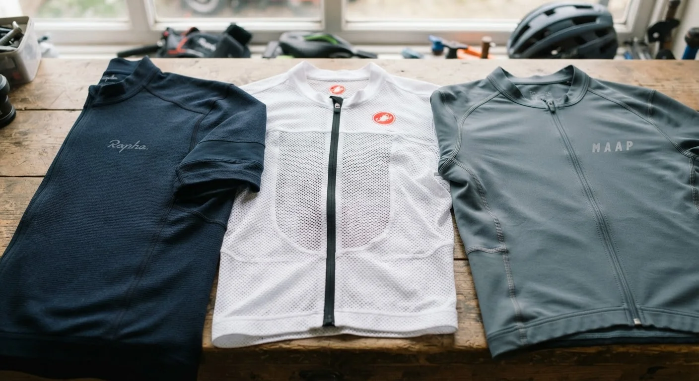
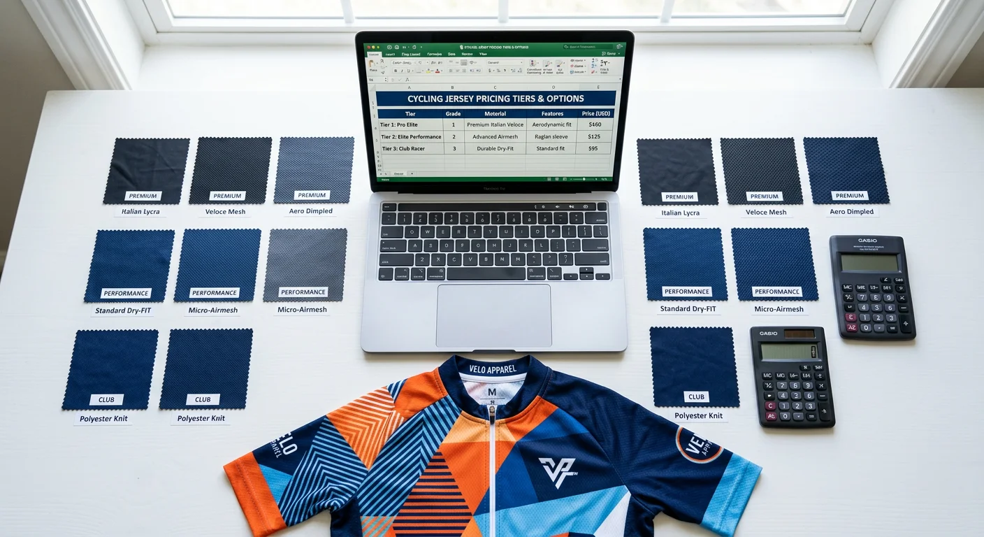
At 42 km/h, your sponsor's logo has less than half a second to register on a broadcast camera before it blurs into color noise. Every cycling jersey design brief has to answer whether the kit can survive motion, distance, and a chaotic race backdrop and still be legible. Team managers and sponsors rarely ask for "better looking" jerseys anymore; they ask for measurable exposure. This piece shows how top UCI and Grand Tour teams engineer sponsor logo placement, color contrast cycling wear, and fabric choices to hold up at race speed, backed by blur simulations, visibility test data, and side-by-side case studies. By the end, you'll have a quantifiable checklist to audit your own team kit design before the next sponsorship deck goes out.This also helps brands plan custom Cycling Jerseys around sponsor visibility from the start.
Contrast Ratios That Keep Sponsor Logos Legible Above 40 km/h
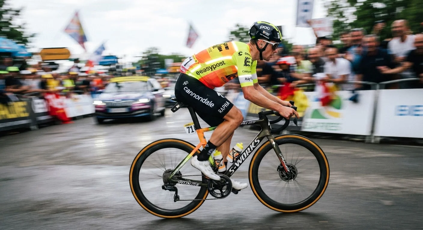
Numbers don't lie, and signage research has been quantifying legibility for decades. Borrow those numbers for cycling jersey design and you get a working formula instead of a guess.
Aim for 4.5:1 contrast as your absolute floor. That's the same minimum used for readable text and sign graphics in accessibility standards. For anything moving — riders, cameras, motion blur — push toward 7:1 . It's the number that separates a logo that reads on a still photo from one that survives a pan shot at speed.
Minimum workable target: 4.5:1
Better for moving objects: 7:1
Oversized sponsor names/large logo text: 3:1 minimum, though stronger is always safer
Sign-industry color-value benchmark: 65% contrast between character and background
Traffic-sign-style benchmark: 8:1–12:1 when maximum readability is non-negotiable
Traffic sign research backs this up further. Static sign studies land around 12:1 for positive-contrast legibility, while variable message signs accept 10:1 . Cycling jerseys face a harder problem than road signs — they're rotating, flexing, sweating, and shrinking in a viewfinder — so treat sponsor logo placement like signage, not fashion.
One more detail matters: finish. Matte, non-glare fabric on both logo and background beats glossy printing every time. Glare kills contrast faster than any color choice can fix, no matter how carefully your formula was calculated on paper.An experienced Cycling Jersey manufacturer can also recommend print finishes that reduce glare.
Chest, Upper Back, and Sleeve Zones for Sponsor Logo Exposure
Real estate on a jersey isn't equal. Three zones matter for sponsor logo placement, and each one earns its spot through a different visibility argument.
Front chest is the title-sponsor slot, period. Standard sizing runs 6–10 in wide for chest logos, or 20–30 cm × 6–10 cm in mockup terms. Left-chest marks scale down to 3–4 in wide , sitting roughly 1 in from the collar . Team-kit guides call this the highest-visibility zone, but wear-life researchers rank it only medium — chest fabric flexes more with breathing and hunched racing posture, and that stresses sublimation printing over a season.
Upper back wins on wear-life. Placement sits 3–4 in below the collar , centered between the shoulder blades, sized 8–14 in wide . Secondary sponsors get 10–18 cm × 3–6 cm here. This zone stays flattest at speed and holds up best across a full campaign.
Sleeves handle smaller secondary marks — 2–4 in wide , often landing near 3 in , positioned on the outer sleeve or midway between shoulder seam and hem. High visibility, but secondary in the hierarchy.
One rule overrides all three: keep every mark on flat, stable fabric . Seams, armpit curves, and sleeve wraps destroy legibility no matter how strong the contrast ratio.
Logo Size, Letterform, and Stroke Standards for Race-Speed Recognition
Typography either survives a squint test or it doesn't. There's no middle ground once a rider hits race speed.
Stroke width is the first place cycling jersey design falls apart. Signage research recommends stem widths at 17%–20% of x-height, with 12% as the absolute floor for hairline strokes on sans-serif faces. Another source lands the sweet spot at 10%–20%, and a separate readability reference pegs it at roughly one-seventh of character height — about 14.3%. All three numbers point the same direction: thin isn't an option.
Serif fonts and delicate detailing collapse into blur above racing speed. The fix is large, bold geometric blocks. Choose sans-serif, geometric, or neo-grotesque letterforms with uniform stroke widths. High-contrast serif faces and thin-weight type don't hold their shape once motion enters the picture.
Spacing matters as much as weight. Condensed tracking crushes logos into an unreadable smear. Generous letter spacing keeps sponsor names legible even when compressed by a lens or blurred by motion.
Case sensitivity counts too. Word-recognition studies show lowercase reads faster than uppercase — a small detail, but one that shifts font choice away from all-caps sponsor treatments when speed-legibility is the priority.
For scale reference, race bib numbering offers a useful benchmark: Arial, Helvetica, Verdana, Roboto, solid fill, no outline, wide spacing, and 1–2 inch-high characters for distant fast reading. Sponsor logo placement should borrow the same logic.Teams should confirm their Cycling Jersey supplier's MOQ before locking the final artwork.
One high-speed branding source sets the bar at under 0.1 seconds for category recognition. That's the real target — bold stems, minimal internal detail, simple silhouettes, high color contrast against the base color contrast cycling wear formula already established.
High-Visibility Color Blocking for Complex Race Backgrounds
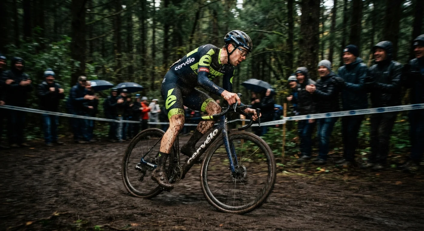
Forest sections. Mud. A wall of spectators in dark jackets. These backgrounds swallow color, and most jersey designs never account for it.
Fluorescent yellow-green, orange-red, and red are the only colors that punch through a chaotic race backdrop. Earth tones and low-chroma blocks disappear the moment terrain gets busy. This is a visibility mandate borrowed from workwear science.
ANSI/ISEA 107 sets the material benchmarks hi vis cycling apparel should target:
Class 1: 217 sq in background material, 155 sq in retroreflective material
Class 2: 775 sq in background, 201 sq in retroreflective
Class 3: 1,240 sq in background, 310 sq in retroreflective
ISO 20471 puts Class 3 at 0.80 m² fluorescent and 0.20 m² retroreflective material. Treat Class 2–3 as the safe zone for reflective cycling apparel; Class 3 wins when large-format color blocking is the goal.
Placement matters as much as coverage. Large solid hi-vis panels belong on the torso and upper limbs, broken by clean geometric contrast blocks — one dark accent max. Reflective striping works best horizontally around the torso, with shoulder and arm bands preserving visibility mid-pedal-stroke. A 2-inch (50mm) reflective band is the minimum for real-world visibility on sports jerseys.
CSA Z96-15 offers a useful comparison point — it demands garments signal presence under headlights, which is nearly the same problem as races that overlap traffic corridors. Commercial precedent already exists: Adidas colorblock running gear pairs bold panels with reflective piping, and a Class 3 color-block hoodie retails at $77. That construction scales into affordable production runs.
Dynamic Blur Testing for Cycling Jersey Brand Recognition
Broadcast footage doesn't care about your mockup. It cares about pixels in motion. Brand recognition either survives the gap between those two things or dies in it.
Gaussian blur testing closes that gap. Run a logo through increasing blur levels, side by side, and measure where it stops registering as a mark. One print-ad study found some brands still identifiable at under 100 milliseconds exposure. That's the floor for fast-glance recognition, and it's the number cycling jersey design should chase.
A cycling-specific computer vision workflow proves the method works on real race footage. Researchers trained detection models on hundreds of annotated images across different lighting, camera angles, and motion blur, then sampled broadcast video at 1 frame per second. Sponsor logo exposure totaled 1,235 seconds, just 6.6% of the broadcast, with average screen share of 0.27% and a peak of 3.91% during close-ups. Team Lucky's jersey fared better: 2,213 seconds, 12% of race time, with 1.63% screen share when visible.
Breakaways and sprint finishes produced the highest visibility. Those are the shot types that matter for sponsor logo placement, not the peloton grind.
Building a Practical Blur Test for Your Own Kit
Skip the lab. Use real footage instead.
Pull ride or broadcast clips at 1 to 5 fps
Test multiple blur levels per logo
Score recall, time-to-recognition, and screen-share area
Track recognition rate at 50 to 100 ms as your industry-standard benchmark
Log minimum readable logo size and motion-blur tolerance by speed and angle
Fabric tension complicates every reading. A logo sitting flat on a mannequin stretches, twists, and folds once a rider hunches over the bars. Sublimation printing shifts shape mid-pedal-stroke, and that is exactly what your blur test needs to capture.
Simple shapes win this fight every time. Fashion-logo research backs it up: small, distinctive marks stay identifiable even when compressed into blur, while complex logos disintegrate. Castelli took the idea further and turned it into branding itself. Their jersey design features a deliberately blurred logo, marketed as "a visual echo of a rider in motion." That is blur as a feature, not a flaw. Most sponsors do not have that luxury. For them, the goal stays fixed: identifiable in close-ups, sprint shots, and breakaways, built on simple shapes and hard contrast, because those are the only conditions where motion blur does not win.
Peloton Recognition Through Repeatable Team Color Signatures
Brand consistency beats novelty every single time a rider gets lost in a pack of forty other jerseys. Peloton's own brand guidance proves the point with almost military precision: the logo lockup runs only in Peloton Black or white, always on neutral backgrounds. Color gets locked out entirely. The guidelines state it flat: do not use any colors when representing the lockup, and never combine the Super Red logomark with a black wordmark. Red exists for one purpose only. It's reserved for the logomark, the brand's single accent hit.
That's the model worth stealing for team kit design: one dominant brand color, one neutral base, one reserved accent, and strict rules for where each can appear.
Peloton's 2023 refresh leaned into this. Company materials called it a bold palette meant to evoke workout energy and its afterglow, built from a shift away from red-and-white toward a black-and-white core with red held back for emphasis.
Cycling teams already run this playbook. One pro squad built its entire identity around blue and white specifically to stay visible "in the sea of blue" mid-peloton. A repeatable two-tone signature, not a busy palette, is what survives the pack.
Professional Team Kit Case Studies for Visual Element Comparison
Sussex County Cricket faced a problem most cycling teams never have to solve: three formats, three kit designs, four colors, one identity that had to survive all of it. County, Blast, and RL50 each demanded their own kit, and the visual system had to stretch across web, social, press ads, outdoor, handbooks, hospitality brochures, and matchday programmes without fracturing. O&G used "the rip"—a single tearing graphic device that signals overcoming obstacles, flexed across every colorway so the concept reads as one brand no matter which kit a viewer sees first.
London Cavaliers took a different route. The rebrand dropped "Thames Valley" and kept the sword icon, modernizing the crest while staying visually distinct from the NBA's Cleveland Cavaliers. Team kit design comparisons can borrow that before-and-after model by tracking team name, icon treatment, and crest style side by side.
What to Document in Your Own Case Study
A proper tech pack captures the same fields every time:
Kit count per season or format
Color count with exact HEX/RGB/CMYK/Pantone values
Placement map for front crest, back number, player name, sleeve marks, sponsor placement
Material spec — sublimated kits run 140–180 gsm, priced around $9–$18 cycling apparel per set FOB
Rollout channels used for the visual system
Compare home vs away contrast, number readability at distance, and referee-clash avoidance. Bold, simple numerals beat stylized fonts every time field-distance legibility matters.
Pattern Density, Clear Space, and Sponsor Hierarchy in Custom Jersey Design
A crowded jersey reads as noise, not branding. Every logo fighting for the same six square inches of chest space cancels the others out.
Center front stays the dominant sponsor position. Team crest goes left chest, cycling jersey manufacturer mark goes right chest. Keep the front of the jersey clean — cap it at no more than 2 sponsor logos. Push everything else to sleeves or back.
Spacing rules keep the hierarchy intact:
0.5–1 inch clear space between any two marks, numbers, or names
Front logo top sits 2–3 inches from the neck edging , or 3–3.5 inches to logo center
Back name sits 2–3 inches from the collar , number 2.5–3 inches below that
Left chest marks run 3–4 inches wide, sleeves 2–4 inches , sponsor chest logos 6–10 inches
Sponsor logos stay near 2–3 inches in height — big enough to register, never bigger than the crest
Keep prints off seams, underarms, and mesh panels. Youth kits scale logos down 20–30% to avoid overcrowding smaller frames. The same rule holds everywhere: team identity leads, sponsors support, and density spreads across chest, sleeve, and back — never stacked in one zone.
Fabric, Printing, and Garment Construction Effects on Visibility
Fabric choice and print application do more work than most kit designers give them credit for. Two mechanisms working together create visibility. Fluorescent background fabric gives daytime pop, and retroreflective tape handles low-light conditions. Construction safety science solved this decades before cycling jersey design borrowed it. Fluorescent yellow-green, orange-red, and red dominate for a reason. One construction safety manual specifically flags fluorescent orange as the strongest daytime performer.
Construction geometry matters as much as color. The standard high-visibility layout runs two vertical stripes on the front with an X pattern on the back. Night-shift variants add extra bands on arms and legs. CSA Z96-15 codifies this as a formal requirement. Apparel must signal presence under any light condition, including vehicle headlights. That's a near-identical problem to race courses that cross traffic corridors.
Printing decisions can undo all of that engineering. Solid ink blocks over fluorescent fabric reduce daytime conspicuity, so safety-print guides recommend small-to-medium logos instead. Roughly 90–100mm on the left chest, 260–280mm on the upper back, always placed to avoid reflective tape. Printing directly over reflective strips is a known failure point; it kills reflectivity outright.
Polyester's heat sensitivity adds one more constraint. Sublimation printing on shiny polyester needs low power and short flash time, or the fabric shrinks and the print distorts. That's exactly the kind of defect that shows up as blur on a broadcast camera before it ever shows up on a hanger.
High-Speed Cycling Jersey Visibility Checklist With Quantifiable Pass Standards
EN ISO 20471 wasn't written for cyclists, but it's the closest thing to a pass/fail exam for reflective cycling apparel. Run any new team kit design through this list before signing off on production.
Fluorescent background area: Class 2 minimum 0.50 m², Class 3 target 0.80 m²
Retroreflective area: Class 2 minimum 0.13 m², Class 3 target 0.20 m²
Reflective strip width: 50 mm minimum, no exceptions
Strip orientation: stays within ±20° of horizontal
360° wrap: reflective bands visible from front, side, and rear — torso plus sleeve bands or equivalent
Fallback comparator: Class 1 (0.14 m² + 0.10 m²) offers weaker conspicuity, useful for benchmarking, not for race-day sign-off
Use Class 2 as the practical floor for road racing. Push to Class 3 when sponsor exposure is the priority, not just rider safety.
Conclusion
At 40 km/h, design mistakes cost sponsors money. Every contrast ratio, logo placement, and pattern decision covered here is measurable ROI protection for the brands funding your roster.
The three takeaways that matter most are that chest and upper-back zones consistently outperform sleeves for broadcast capture, a minimum luminance differential separates "visible" from "invisible" logos on camera, and dynamic blur testing catches failures no static mockup ever will.
Cycling jersey design at this level is a checklist discipline. Before your next kit goes into production, run it against the quantifiable standards outlined above. Test under motion, not on a mannequin. Compare your color-blocking against at least one WorldTour case study.For larger team orders, request a custom wholesale price for Cycling Jerseys before production.