Your jersey sits crumpled in a bag somewhere. It's the one your team ordered two seasons ago. Nobody wants to wear it — the colors clash, the logo looks off-center, and the fabric turns into a sauna by mile fifteen. Sound familiar?
Getting a custom cycling jersey your teammates want to pull on isn't complicated. It just takes the right decisions in the right order. This step-by-step guide shows you how to design your own custom cycling jerseys from a blank canvas to a print-ready file. You'll cover sublimation printing specs, fabric selection, color choices, and sponsor logo placement. No design degree needed. Just eight clear steps, a few hard-learned lessons from someone who's done this more times than he'd like to admit, and a checklist you can start using today.
Step 1: Define Order Scope & Establish Team Requirements
Most custom jersey projects fall apart before a single pixel gets placed. The reason? Nobody agreed on what they were ordering.
Before you open any cycling jersey design software or touch a jersey color scheme, lock down two things: what you're making and who it's for . Everything else — fabric selection, sizing, print files, budget — depends on these answers being set in stone, not left open.
Single Jersey or Full Kit?
This is your first decision, and it shapes your entire project scope.
A single custom cycling jersey keeps things simple. Choose your zipper type (standard or full-zip cycling jersey). Decide on 3-pocket vs. zippered security pocket. Confirm whether the collar tape carries branding. That's it — clean and contained.
A full kit — bib shorts, gilet, arm warmers, socks — multiplies every decision you make. Panel alignment across items becomes a real issue. One wrong assumption about fit, and your coordinated kit looks mismatched in person.
Build Your Sizing Matrix Before Design Starts
Here's a mistake I've made twice: starting the CAD layout before headcount was confirmed. Don't do it.
Collect every rider's measurements first. Then split your roster:
Race fit (tight, performance cut) — 60% of a competitive squad order
Club fit (relaxed cut) — 40%, covering recreational riders and support staff
Match those measurements against height/weight percentiles to confirm 100% coverage. Then add a 10–15% spare stock buffer for returns, late additions, and sizing swaps. It sounds like over-ordering. It isn't — it's basic protection against last-minute chaos.
Assign Clear Roles Before Anyone Opens a Template
Someone owns design. Someone owns sizing approvals. Someone owns sponsor logo collection. Leave those responsibilities unassigned, and tasks fall through the gap between "I thought you were handling that" and "we're three weeks behind schedule."
Write it down. A shared spreadsheet with names next to tasks is enough. It stops the overlap and confusion that stall production before it starts.
Deliverable for this step : A completed Order Specification Sheet — confirmed jersey type, quantity split by fit, sizing matrix with spare allocation, assigned roles, and a locked production timeline before design begins.
Step 2: Gather Brand Assets & Compile Visual References
The single biggest production delay I've seen — across every jersey project I've coordinated — isn't a design problem. It's a missing file problem.
Two weeks into the design cycle, someone can't find the sponsor's logo. Another sponsor sends a JPEG screenshot from their website. Your club crest exists as a PNG buried inside a Word document. Production stops. Deadlines slip. Everyone gets frustrated.
Treat this step like a logistics operation, not a creative one. That's how you avoid the chaos.
Build Your Asset Package First
Before anyone touches a cycling jersey template or opens design software, collect every file that will appear on the jersey. Be strict about format requirements:
Logos (yours and every sponsor's): Vector files — AI, EPS, or SVG. These scale to any size without pixelation. A sponsor sends you a PNG? Go back and ask for the vector source file. No exceptions.
Sponsor artwork : High-res PNG at 300 DPI minimum , with alpha-channel transparency so it sits cleanly on jersey panels
Brand colors : Exact Pantone PMS codes — not "our color is kind of a deep blue." Document CMYK and RGB equivalents side by side in a simple spreadsheet
Typography : The actual font files (.OTF or .TTF), not just the font name. Convert all text to outlines/curves before sending to your cycling jerseys manufacturer. This removes font-substitution errors at the source.
Name every file with a consistent convention. Something like takes thirty seconds to set up and saves hours of version-confusion later.
Compile a Visual Reference Board
Once your assets are locked, build a reference board. Not for decoration — use it as a shared decision-making tool. Pull three categories of reference:
Pro peloton kit photography : High-res race images showing real sponsor placement, panel proportion, and pattern density under sunlight and movement
Competitor and adjacent club kits : Look at 3–5 other teams' jerseys. Note what reads well from twenty meters away and what disappears into visual noise
Color and pattern trends : Instagram club feeds and cycling event coverage show you what's being worn on the road — not just what looked sharp on a screen
Here's one principle worth knowing: sponsor logo placement decisions get much easier with printed reference showing actual chest panel coverage ratios. A sponsor logo needs to cover at least 12% of its panel to stay readable at speed — that's about 10cm × 5cm on a standard chest placement.
Deliverable for this step : A complete vector asset package (all logos in AI/EPS/SVG, color codes in PMS/CMYK/RGB, font files with outlines converted), plus a reference board with 3–5 kit comparisons and a documented panel coverage guide — all uploaded to a shared drive with consistent file naming before design layout begins.
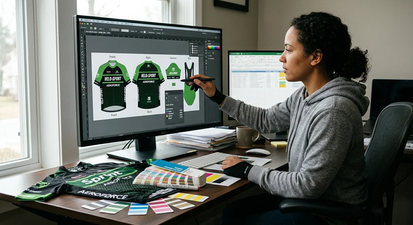
Step 3: Draft Initial Layouts Using Cycling Jersey Design Software
Pick the wrong tool first. You'll spend three hours fighting software instead of designing a jersey.
Here's how to avoid that: choose your platform based on what you have right now — not what sounds most professional. Got a dedicated graphic designer on your team? Hand them the cycling jerseys manufacturer's 9K resolution PSD template and let them work in Photoshop with full layer control. You're the designer by default? (Welcome to team management.) Start with an online builder. Platforms like Wooter and Stolen Goat AI let you upload vector logos, drop in Pantone references, and generate a working 360° mockup within a day or two — no design software license needed.
Map Your Panels Before You Place Anything
The single mistake that ruins otherwise good layouts: treating a jersey like a flat poster.
A jersey isn't flat. It wraps, folds, stretches, and drapes in a completely different shape under an aero tuck than it does on a hanger. Before placing any graphic, map these three zones:
Zipper placket exclusion zone — no critical logos, no fine text. Graphics crossing the zipper placket split in half and read as broken, not bold.
Race number clearance zone — reserve the lower back panel. Any graphic placed here gets covered by a pinned race number during competition. Mark it blocked in your template from day one.
Seam wrap-around distortion zones — shoulder and side panel seams shift artwork by 8–12mm depending on the cut. The 3D drape preview in tools like owayo or Voler Studio shows this distortion before it hits production.
The 50-Meter Visibility Test
Pull up your 3D mockup. Step back from the screen. Go on — step back for real. Squint.
Your sponsor logo reads from across the room? It'll hold up at 50 meters on course. It disappears into background color? It won't survive real-world conditions. Bright anchor colors and clean sans-serif typography pass this test every time. Intricate gradients and thin script fonts fail it almost every time.
For sponsor text placement : diagonal runs across the upper shoulder hold legibility in an aero posture far better than horizontal hem placement. Horizontal placement distorts under movement. Test both orientations in your 3D preview before you lock anything in.
Run two to three mockup iterations — front, back, both sleeves, collar height — before finalizing the layout. Check pocket alignment against rear panel seams. Confirm the collar height works with your helmet strap. Each check takes ten minutes. Skipping them can cost you weeks of production rework.
Deliverable for this step : A complete 360° digital mockup — front, back, left and right sleeves, side panels — with all sponsor logos placed, zipper and race number zones respected, and visibility confirmed at simulated distance. Save the file in your manufacturer's required format before design review starts.
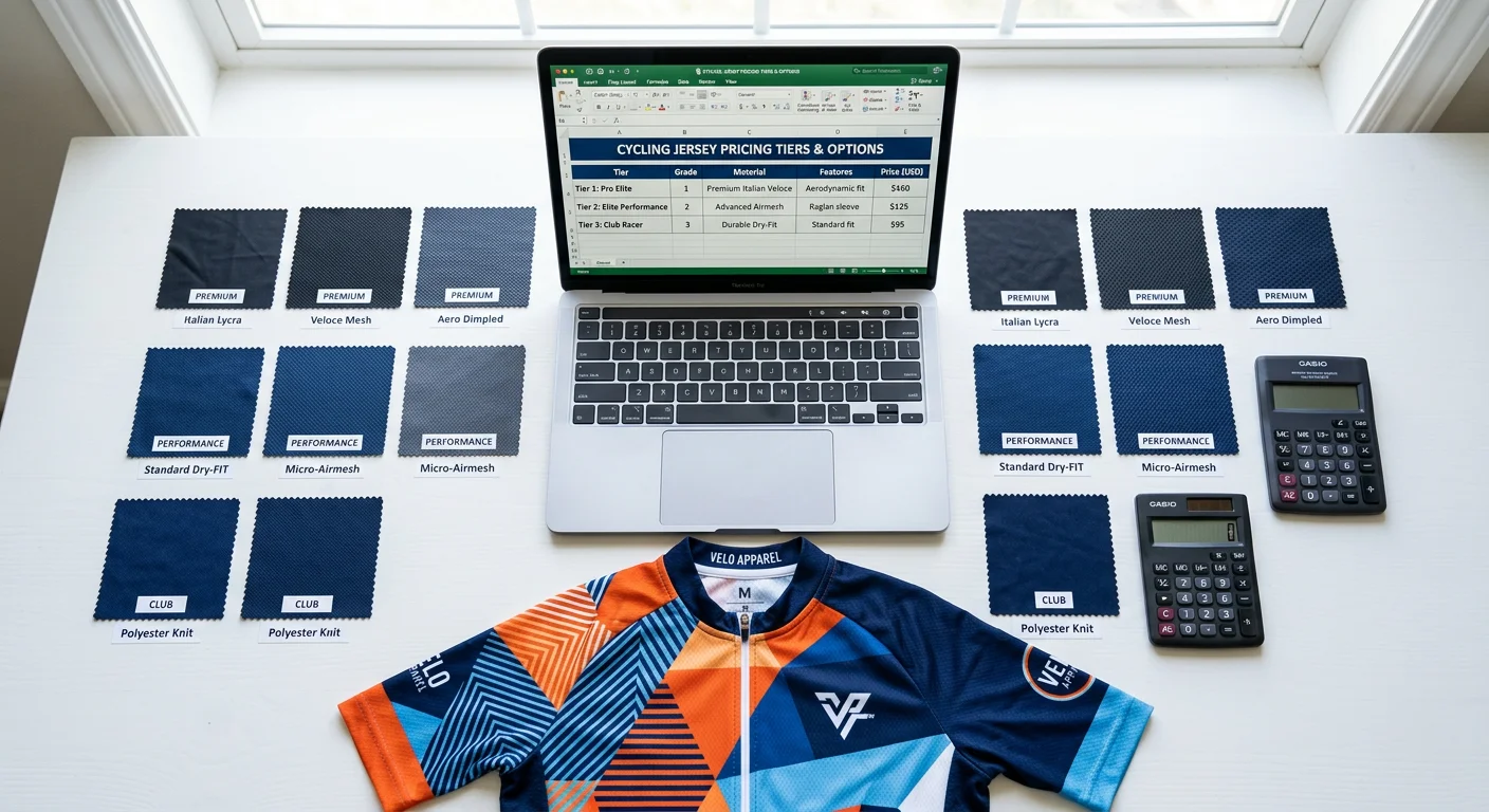
Step 4: Select Fabrics & Match to Riding Scenarios
Most teams get this wrong. They default to whatever the cycling jerseys manufacturer recommends at the lowest price point. The result? A jersey that's wearable on paper but miserable in practice — soaked through by mile twenty, or stiff as a rain jacket on a 90°F crit day.
Price per unit isn't the number that matters. It's GSM — grams per square meter . GSM is the one spec that controls breathability, weight, warmth, and print quality all at once. Everything else follows from there.
The Four Riding Scenarios, Matched to Specific Fabrics
Hot-Weather Racing & Summer Crits (Target: ≤120gsm)
You want open-weave structures that move air, not trap it. These fabrics are built for that:
LightWovenGrid — 80gsm, open-weave mesh, maximum ventilation
MITI VELODROME GREEN — 95gsm, 100% recycled polyester, ultralight sprint fabric
MITI FULL MOON — 105gsm, UPF-rated, purpose-built for heat-adapted racing
Moisture-wicking targets in this range: ≥800g/m²/h wicking rate , minimum 4g/hr. Your own custom cycling jerseys supplier should confirm those specs. Ask directly if they don't volunteer the data. Also, elastane content here should sit at 14–20% — enough for race fit without adding compression bulk that holds heat in.
For UPF protection in summer races, MITI VELODROME GREEN and MITI FULL MOON are the two fabrics in this weight class with a verified UPF rating. That matters for teams riding long-exposure events.
One warning about 80gsm mesh panels: opacity is too low for standalone panel use . At that weight, light passes straight through. Your sublimation print loses depth, and the jersey goes see-through under direct sunlight. Layer mesh panels over a base fabric, or use them as ventilation zones — not primary panels.
Endurance Road & Club Riding (Target: 140–160gsm)
This is the most forgiving range to work in. These fabrics balance breathability, durability, and print vibrancy. That makes them the go-to for team orders with varied rider types:
Xiwen — 140gsm, standard structured knit, core endurance fabric
Lycradzd — 140gsm, 92% polyester (excellent sublimation uptake), structured knit
DeanGrid — 150gsm, tight grid weave, adds mild wind resistance without adding weight
MIXC — 150gsm, 80.5% polyester + 19.5% elastane, handles all-season training
Elastane content in this range should stay between 7–20% . That gives you full 4-way stretch for pedaling range, without pushing into compression-recovery territory that doesn't suit a standard jersey cut.
Spring/Autumn Variable Conditions (Target: 130–165gsm)
Shoulder-season riding brings big temperature swings. You need fabrics that hold fit across a wider body-temperature range:
1.MITI Asteria — 130gsm with UPF protection, built for long endurance days with hours of sun exposure
2.MITI PIANOSA — 165gsm, 25% elastane, pilling-resistant finish that holds up through a full season of repeated washing
The right layer strategy: jersey + detachable arm warmers. Don't try to cover temperature range with one heavy fabric. You'll overheat on climbs and freeze on descents. A 165gsm jersey paired with removable arm warmers gives you more flexibility than a 200gsm jersey on its own.
Winter & Wet Conditions (Target: 230–240gsm)
1.MITI LOMBARDIA DWR M — 235gsm, DWR (Durable Water Repellent) finish, wind-resistant
2.8020Lycra — 240gsm, dense thermal knit, brushed fleece inner, high compression retention
High elastane content (18–28%) is a hard requirement at this weight range. Dense thermal fabrics without enough elastane restrict movement and lose their fit after the first few cold-weather washes.
One check to run before approving any DWR-finished fabric: confirm DWR coating compatibility with sublimation ink before production starts . Some DWR coatings block dye penetration during sublimation. Your print comes back faded or patchy — on the premium fabric you paid extra for.
Sublimation Printing & Fabric Compatibility
Not every fabric above is sublimation-ready. This is where a common, expensive mistake gets made.
Sublimation requires ≥85% polyester content to work. The dye migrates into polyester fiber during heat transfer. Lower polyester percentages mean shallower dye penetration and weaker color vibrancy.
Fabric Type | Sublimation Compatible? | Why |
|---|---|---|
MITI VELODROME GREEN (100% recycled polyester) | ✅ Yes | Maximum dye uptake |
Lycradzd (92% polyester) | ✅ Yes | High polyester, consistent result |
DeanGrid (93% polyester) | ✅ Yes | Tight grid holds ink depth well |
Carvico REVOLUTIONAL® ENERGY (polyamide base) | ❌ No | Nylon accepts acid dyes, not sublimation |
8020Lycra (polyamide 82%) | ❌ No | Insufficient polyester content |
One more thing to keep in mind: elastane does not accept sublimation dye . Fabrics with higher elastane percentages — like Carvico Renew Prime at 35% elastane — will show reduced color opacity, even if the polyester base clears the threshold. Build your color palette around this. Deeper, saturated base colors handle the opacity loss better than pale or pastel choices.
Pre-Production Fabric Checklist
Run through these five checks before approving any fabric for bulk production. Skip one, and the problem shows up after production is done — the worst possible time.
✅ Request a physical swatch card — GSM and opacity vary between colorways even within the same fabric
✅ Stress-test seams at 15% elongation — this prevents post-sublimation puckering at stress points
✅ Confirm DWR + sublimation compatibility in writing from the reliable cycling jerseys supplier
✅ Verify UPF rating retention after washing — this is critical for 80–90gsm mesh structures where opacity is already borderline
✅ Confirm care instructions with your team : cold wash, air dry, no fabric softener — softener clogs wicking fibers and the damage is permanent
Deliverable for this step : A finalized fabric selection documented by scenario — primary jersey fabric (with GSM, composition, and sublimation compatibility confirmed), ventilation zone fabric for mesh panels, and a signed-off pre-production swatch approval from your manufacturer before any print files are submitted.
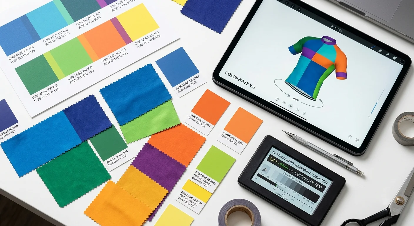
Step 5: Finalize Color Schemes & Apply Layout Psychology
Color is the first thing a marshal sees. It's the last thing a competitor forgets. Most teams treat it as decoration — a quick pick from a cycling apparel manufacturer's swatch card, maybe a nod to the club's existing banner, and done. That's how you end up with a jersey that looks sharp on a screen and muddy on a mountain descent.
Three methodologies. Pick one, stick with it, and don't second-guess yourself halfway through production.
The 60-30-10 Rule
This is the most reliable starting point for teams with no design background.
1.60% dominant color — your base panels, the visual weight of the jersey
2.30% secondary color — structural accents, shoulder blocks, collar and hem detail
3.10% accent color — sponsor highlights, trim, that single pop of contrast that makes the jersey readable from fifty meters
Stray from this ratio and the jersey starts fighting itself.
Color Psychology by Riding Context
Your color choice sends a signal before anyone reads a single word:
1.Navy and charcoal read as corporate authority — right for sponsored fleet teams, wrong for a criterium squad trying to look aggressive
2.High-saturation orange paired with cyan or blue sits on opposite ends of the color wheel. That pairing signals speed and visibility at the same time. It works because the contrast comes from the color relationship itself — not forced in from the outside
Contrast Validation: The Rule Nobody Checks
WCAG AA standard requires a minimum 4.5:1 contrast ratio between text or sponsor logos and their background panel. That's not a web rule shoehorned into jersey design — it's a practical outdoor visibility benchmark. Test it. Run a contrast checker before any file goes to production.
Five contrast mistakes that show up in almost every first-time jersey order:
1.Neon layered over neon — similar hues, zero separation, unreadable at race speed
2.Dark logos dropped onto deep black panels — the logo disappears
3.Gradient banding across curved seam panels — sublimation heat isn't even across the fabric, and gradients expose every inconsistency
4.Clashing undertones — cool-spectrum blues next to warm-spectrum reds create visual tension that reads as an error, not contrast
5.Missing the RGB-to-CMYK shift — what glows on your monitor prints flatter than you expect. Run a CMYK gamut warning overlay on every screen mock before you approve it
The A/B Test Before You Commit
Build three to five color scheme variations using tools like Canva's palette generator, Color Palette Studio, or HueSnap. Print each version — not just on screen — and hold it under direct outdoor light. Sunlight kills weak contrast faster than any monitor preview.
Go with solid fills over photorealistic gradients for sublimation work. Solid fills hold across dye lots. Gradients don't.
Deliverable for this step : A finalized three-color palette with documented Pantone PMS, CMYK, and RGB values — contrast ratios validated at 4.5:1 minimum, CMYK gamut warnings cleared on all panel mocks, and a signed-off color approval from your team before any layout file moves to the manufacturer.
Step 6: Prepare Print-Ready Artwork & Technical File Specs
A beautiful design sent in the wrong file format is just an expensive mistake waiting to happen.
Most first-time jersey projects fall apart at this step. Not because the design was bad — but because the file sent to the manufacturer was missing bleed settings, saved in RGB, or had text that was never converted to outlines. The print comes back wrong. The team blames the cycling jerseys manufacturers. The supplier pulls up your file and spots the problem in thirty seconds flat.
Get this part right, and everything downstream runs clean.
Resolution: The Number That Matters
For any raster or photo element in your jersey artwork, 300 DPI at 100% print size is your floor — not your target. Optimal sits between 300–450 DPI. Push past 600 DPI and you're adding file bloat with no visible print improvement.
One rule that trips up first-timers: DPI applies at the actual output size. A logo that looks crisp on screen at 72 DPI does not become 300 DPI when you drag it larger. Can't get a vector source file? Use 300 DPI at full production dimensions — that's the hard minimum. Anything below that blurs in sublimation transfer.
Color Mode: CMYK, No Exceptions
Convert everything to CMYK before you build the file — not after. RGB-to-CMYK conversion at the export stage shifts colors in unpredictable directions. That electric blue on your monitor prints as a muted navy. The neon orange becomes burnt copper.
For Pantone spot colors: convert each PMS reference to its CMYK process equivalent using your cycling apparel manufacturer's confirmed conversion table. Lock those values as named swatches. Don't leave any live spot colors in the final file.
Bleed, Trim Marks & Stroke Weights
1.Bleed area : 2–5mm on every edge for any design that runs to the panel boundary. Extend backgrounds and fill graphics beyond the trim line — not up to it.
2.Crop and trim marks : enabled on all edges in your export settings, every time.
3.Minimum stroke weight : 0.25pt. Anything thinner vanishes or creates hairline artifacts during sublimation transfer.
File Format & Layer Architecture
Submit your production file as PDF/X-4:2008 or PDF/X-1a — both are press-compatible standards your cycling wear manufacturer's RIP software can read without issue. Flatten the PDF to a single layer before delivery.
Text handling : convert every character to outlines or paths before the file leaves your hands. Font substitution errors are invisible during production — the cycling clothing manufacturer's system swaps your font for a system default. You won't catch it until the finished jerseys arrive.
Logos and graphics : vector files (AI, EPS, SVG) for everything. Use raster images only where photography is necessary.
Pre-Submission Preflight Checklist
Run this before you upload anything:
✅ All colors confirmed as CMYK — no RGB values, no live PMS references
✅ Resolution at 300 DPI minimum for every raster element at final print size
✅ Bleed set to 2–5mm on all edges, trim marks active
✅ All text converted to paths or outlines
✅ No critical logos, text, or sponsor graphics placed within 3mm of any seam line
✅ File format: PDF/X-4:2008 or PDF/X-1a, flattened
One format to cut from your workflow: Word, PowerPoint, or any Office-based export . These tools compress images, strip color accuracy, and produce files no professional manufacturer can work with.
Deliverable for this step : A flattened PDF/X-4 production file with CMYK color mode confirmed, 300–450 DPI raster resolution, 2–5mm bleed on all edges, all text outlined, layers named by panel location, and a completed preflight sign-off — submitted alongside a packaged folder containing all linked assets and original vector source files.
Step 7: Validate Manufacturer Communication & Approve Pre-Production Proofs
A jersey that arrives looking nothing like your approved design isn't a factory mystery. It's a communication failure. Trace it back far enough, and you'll find one skipped approval step between file submission and bulk production.
This is where you slow down. On purpose.
Establish a Single Point of Contact
Before anything gets made, lock in one person on the manufacturer's side who owns your project. Every revision, every sign-off, every question goes through that one person. Split communication across multiple contacts and critical details fall into gaps. You find those gaps when finished jerseys arrive at your door.
Set a hard limit: no more than three revision rounds . Document every change in writing. Verbal confirmations during sample review disappear fast. Written sign-offs stay on record.
Request a Physical Strike-Off — Not Just a Digital Proof
Digital proofs mislead you. Monitor color profiles, screen brightness, and RGB rendering all make colors look richer and more saturated than sublimation ink on real fabric can produce.
Request a physical strike-off sample for every colorway before bulk production starts. Evaluate it with clear criteria:
1.Hold the strike-off under 5000K daylight-balanced light — the standard for apparel color assessment
2.Cross-reference every panel color against its Pantone PMS reference
3.Approve it only if the result falls within ±1.5 Delta E of your approved lab dip
That ±1.5 Delta E threshold exists for a reason. Skip this check and batch color deviation in bulk sublimation runs at 5–10% . On a 100-piece team order, that's ten jerseys that look off-color compared to the rest of the kit.
Pre-Production QC Inspection Points
After strike-off approval, run through these checks on your pre-production sample before you authorize bulk release:
✅ Fabric lot verification — confirm the production roll matches the approved swatch. A different fabric lot, even the same SKU, can shift color absorption during sublimation
✅ Seam and stitch inspection — ISO 401/504 for structural seams, 602 coverstitch at hems, bar tacks at all stress points (pocket corners, zipper base)
✅ Zipper and trim brand match — confirm against your tech pack spec table. Substitutions happen without notice when original trim stock runs short
✅ Logo and panel alignment — measure placement against your approved CAD markers. A 5mm shift on the chest panel stays hidden in a digital proof and stands out on a finished jersey
✅ Label and pocket placement — check against tech pack; verify pocket elastic tension rating before cutting starts
The Timeline Reality
Pre-production sample turnaround for custom cycling apparel runs 15–28 days from file submission to physical sample delivery. Build that window into your project timeline before production starts — not after.
Request a TOP (Top of Production) sample once bulk cutting begins. This is your last checkpoint before the full run finishes. It's also your last chance to catch a systematic error before it repeats across every unit in your order.
Deliverable for this step : A signed bulk release authorization — physical strike-off approved within ±1.5 Delta E, pre-production sample QC checklist completed, TOP sample reviewed and signed off, and all revision changes documented in writing before bulk production moves forward.
Step 8: Conduct Final QC Review & Execute Order Fulfillment
Boxes arrive. Jerseys get pulled out. Someone holds one up under the warehouse light and says nothing. That silence is either relief or the start of a very expensive conversation.
Don't leave it to chance.
Run AQL-Based Random Sampling First
Pull 10% of the batch before a single unit gets sorted or shipped. Check each piece against your golden sample across three defect categories:
1.Critical — safety failures (sharp hardware, structural tears)
2.Major — functional failures (zipper won't seat, seam separation under stretch)
3.Minor — cosmetic issues (small print inconsistency, light surface marks)
Your batch QC report must include high-resolution defect photos, a measurement table, and a Pass/Fail/Pending result. It needs to be out within 24 hours of inspection. No report means no shipment authorization. That's the rule.
Four Checks Before Release
✅ Invoice quantities match the PO — size and color breakdown included
✅ Wash shrinkage tested on holdback pieces: under 5% per industry standard
✅ Zipper smoothness and seam integrity confirmed on sampled units
✅ Individual polybags sealed, size labels accurate, barcodes scannable
Spot a defective unit? Pull it out now. Set it aside for repair or replacement. Also, allocate a 2–5% holdback for post-delivery returns — that buffer exists for a reason.
Ship Smart, Archive Everything
For cross-border orders, customs documentation must match PO quantities. Any mismatch delays clearance and holds your entire shipment.
Once jerseys land with your team, track three numbers: order accuracy above 99%, return rate below 2%, print durability past 20 washes with no fading exceeding 10% . Store your final CAD files and specs as a reorder baseline. Starting a second project from scratch is costly. Having everything from the first run documented and ready is the best way to avoid that.
Conclusion
You now hold the complete roadmap — from a blank canvas to a jersey your whole team will wear with pride.
The riders who end up with stunning, print-perfect jerseys aren't the ones with design degrees. They're the ones who got three things right:
1.Picking the right breathable cycling jersey material for their actual riding conditions
2.Locking in a color scheme with clear contrast and visual hierarchy
3.Submitting clean, print-ready files with no technical errors
Everything else in this guide exists to protect those three outcomes.
What separates a forgettable first attempt from a jersey that turns heads at the start line? Attention at every decision point — not just the fun creative parts. The small choices add up fast.
So don't wait for the "perfect idea." Open your jersey design software today. Pull up that team brief. Run through Step 1. The checklist is ready. The framework is yours.
Your custom cycling jersey doesn't get designed someday. It gets designed now .