Choosing the wrong printing process for your cycling kit isn't just a design problem — it's a performance problem.
Screen printing on performance cycling apparel hits a sweet spot most buyers miss. It survives hundreds of wash cycles. It keeps sponsor logos sharp and clean. Plus, bulk orders become far more cost-effective with this method.
That said, it's not the right call for every jersey, every fabric, or every design. Knowing which method wins in each situation separates a great kit from an expensive mistake. Screen printing has clear strengths — but sublimation and other methods pull ahead in certain cases.
This guide covers real-world applications, technical trade-offs, and the practical decisions that matter most.
5 Key Benefits Of Screen Printing For Custom Cycling Jerseys And Kits
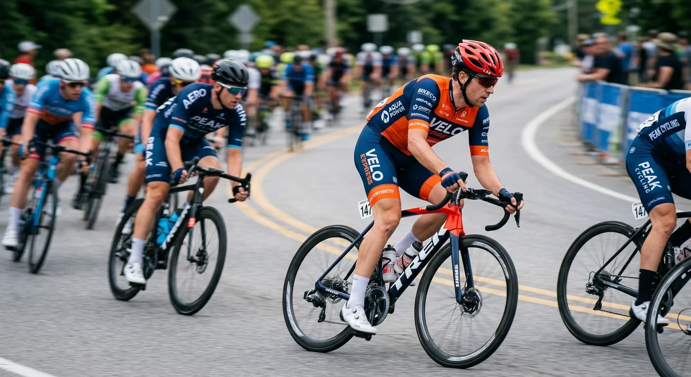
Screen printing holds its ground in performance cycling apparel for one clear reason: it solves real problems that other methods don't. Durability, visibility, cost, placement flexibility — these aren't abstract qualities. They're the difference between a kit that lasts a full racing season and one that starts peeling after the third wash.
Here's what screen printing delivers.
1. It Survives the Wash Cycle — Season After Season
Most cycling clubs wash their kits hard. Cold water, warm water, twice a week during peak training blocks. That's 50+ wash cycles a season for serious riders.
Quality plastisol ink, cured right, holds up through 20–30 hot-machine washes before showing any real color loss. Sponsor logos and team identifiers just need to stay legible and hold their shape. That's one to two full competitive seasons of regular use — covered.
The contrast with heat transfer is sharp. Heat-transfer prints start lifting and cracking at high-stretch zones — shoulders, thighs — after as few as 10–20 high-temperature washes . Full sublimation outlasts both on raw wash count (50+ cycles, zero peeling), but it brings its own trade-offs covered elsewhere in this guide.
Clubs and event organizers who need durable logo placement without replacing kits every season will find screen printing on moisture-wicking polyester fabric to be a proven, cost-effective baseline.
2. Color Opacity That Makes Sponsor Logos Stand Out
On dark cycling jerseys — black, deep navy, charcoal — standard digital printing fades into the background. Screen printing doesn't. It lays down multiple ink passes with high-opacity coverage, so the color holds.
The standard approach for dark-base kits starts with a white underbase layer (one or two screens) , then the color logo goes on top. You get near-complete coverage of the base fabric. Color contrast reads at 30–50 meters at riding speed.
That matters more than it sounds. In a moving peloton at 30–40 km/h, high-contrast logos stay visible to photographers, race cameras, and roadside observers. Sponsors evaluating kit ROI focus on how many video frames their logo appears legible . Sharp-edged screen prints hold that legibility across distance and motion far better than semi-transparent single-layer prints.
The benchmark many sponsors set: logos must stay readable at 20–30 meters after 30–50 wash cycles , with no blurred edges. High-stretch screen printing ink on polyester cycling fabric hits that standard every time.
3. Unit Cost Drops Fast at Scale
Screen printing carries a front-loaded cost structure. Setup fees run per color, per design . After that, the per-unit cost drops fast as quantity goes up.
Here's how the numbers break down for a club kit with a three-color primary logo plus two sponsor marks:
Order Volume | Setup Cost as % of Unit Price |
|---|---|
30 kits | ~10–20% |
100 kits | ~5–10% |
At 20–30 pieces , screen-printed logos run $3–5 per unit . At 100+ pieces , that drops to $1–3 per unit — a real difference for clubs and event managers working within fixed kit budgets.
Full-body sublimation gives you more design flexibility. But at 20–50 pieces, a base-fabric jersey plus screen-printed logos almost always costs less per unit than a sublimated equivalent. For regional clubs, amateur teams, and event volunteers who need clean, branded kits without premium pricing, screen printing at volume is the go-to cost-efficient choice.
4. Smart Placement Options That Don't Hurt Performance
Not every part of a cycling jersey handles the same level of ink coverage. Screen printing works across multiple locations on the same kit — but placement decisions affect both visibility and breathability.
Here's the breakdown:
Location | Breathability Risk | Brand Visibility | Recommended Approach |
|---|---|---|---|
Front chest | Low | Very high | Medium coverage, high-opacity ink |
Upper back | Low–medium | Very high | Medium coverage, high-opacity ink |
Back pocket area | Medium–high | High | Small logo, controlled ink thickness |
Sleeves | Low–medium | Medium | Small design, high-stretch ink |
Side panels / underarm | High — avoid heavy coverage | Medium | Minimal or no printing |
Outer thigh / shorts | Medium | High | Elongated logo, high-stretch ink |
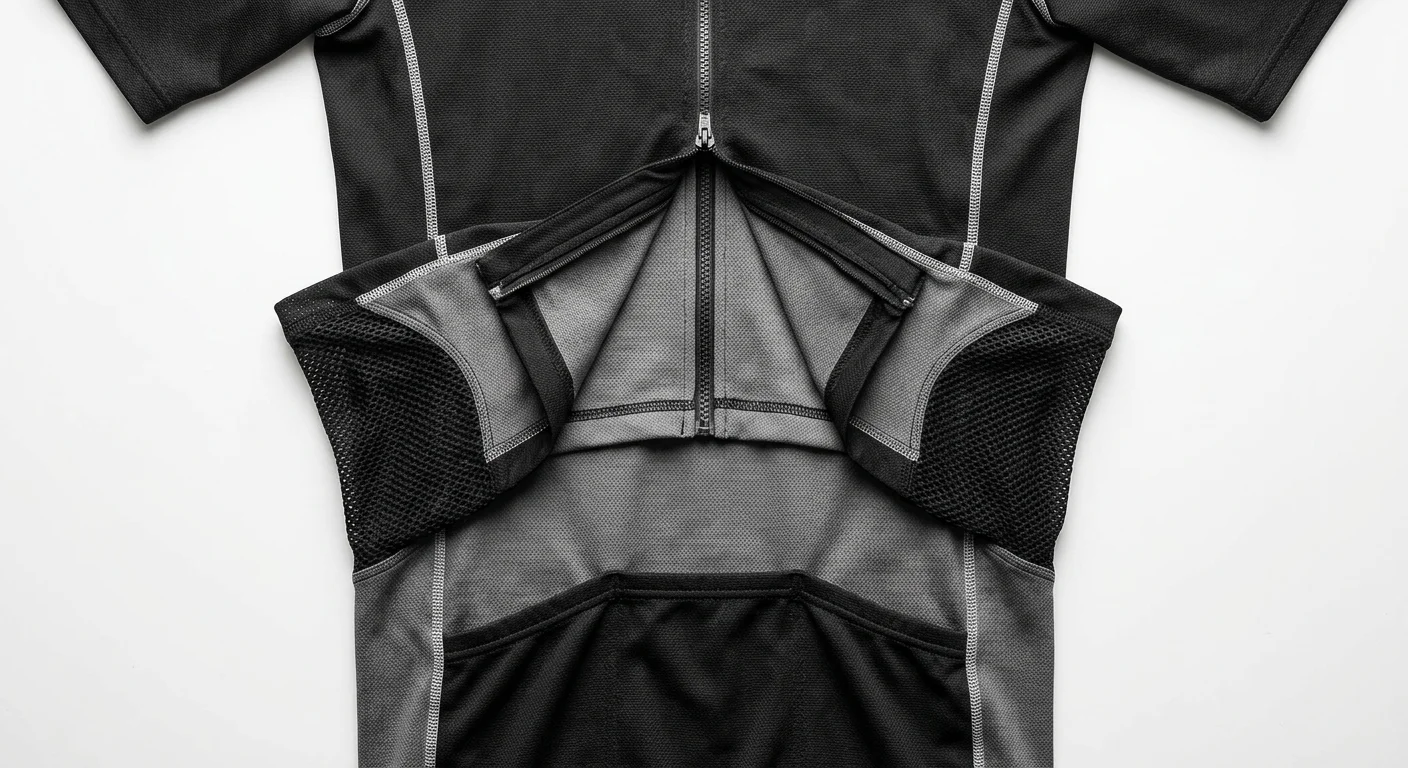
Side panels and underarm zones handle ventilation on breathable cycling apparel. Dense ink layers there cut airflow — you'll feel it. The back pocket area already adds layered fabric. Thick ink there slows moisture movement. These aren't theoretical concerns. They show up in wear testing.
A solid club kit uses 3–5 print zones — chest, upper back, sleeves, shorts side panels. That balance gives you strong brand exposure without hurting performance. Screen printing lets you tune ink type and coverage for each zone , which most other processes can't do at the same price point.
5. Consistent Results Across Large Batch Runs
Picture 150 riders rolling to a start line in matching kits. The logo on jersey one and jersey one-fifty need to look identical. Screen printing delivers that.
Once the screens are set and ink mixing is locked in, every print pulls from the same setup. Color variation between units stays minimal. Edge definition holds across the full run. That matters for team kit branding and sponsored event apparel , where visual uniformity is part of the professional look.
Digital printing introduces more unit-to-unit variation at scale. Ink density shifts. Color drifts across a long production run. Screen printing's mechanical repeatability cuts out that variable entirely. For cycling team kits where sponsor logos must look identical across an entire squad , that consistency isn't optional — it's a hard requirement.
Best Application Scenarios: Screen Printing For Your Cycling Kit
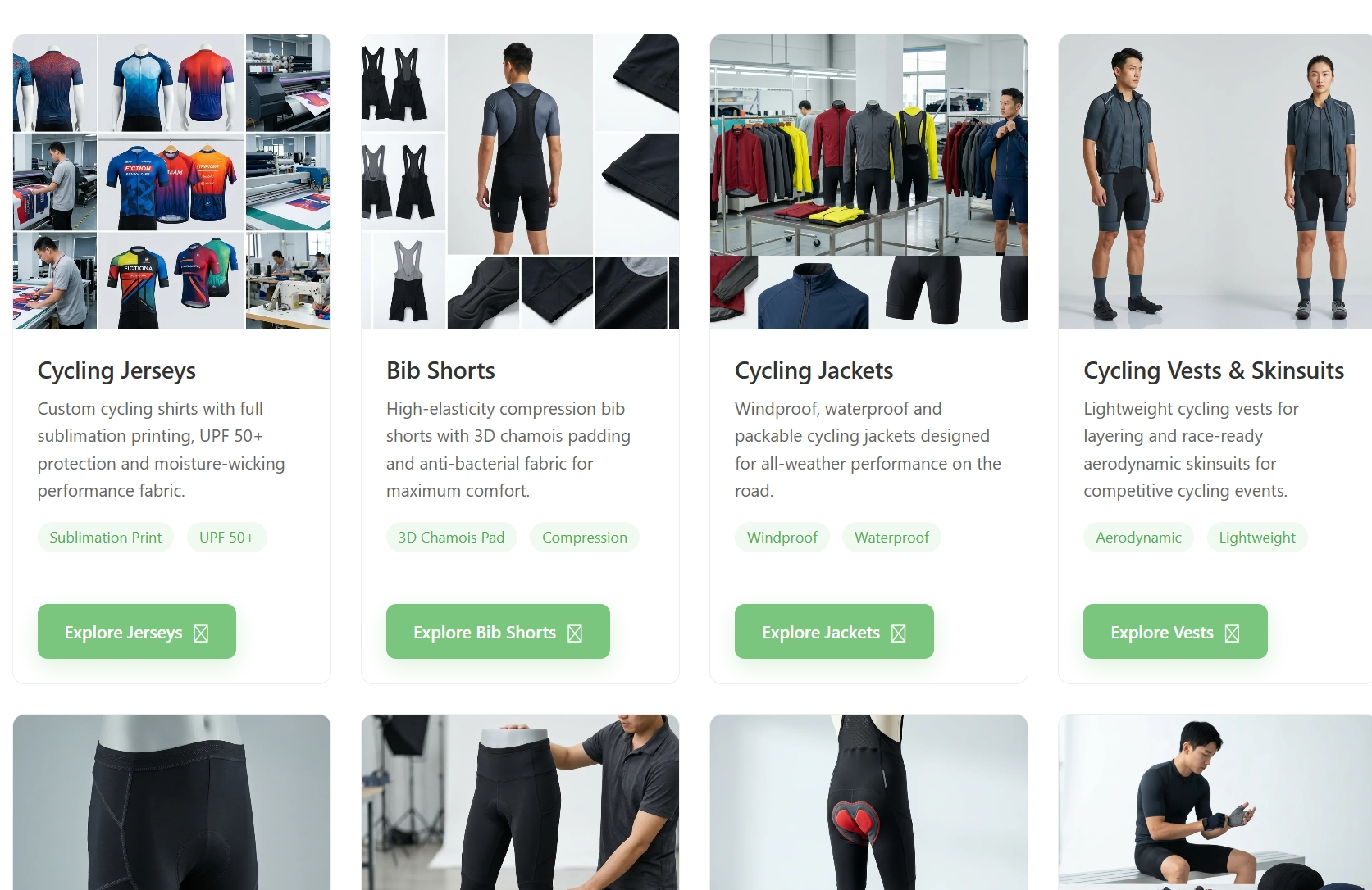
Screen printing isn't the universal answer for cycling apparel. In the right conditions, though, it's the most reliable and cost-effective process out there. The key is knowing what those conditions are.
Three variables decide whether screen printing is your best move: order volume, color count, and graphic type . Get all three right, and you get professional, durable branding at a price that makes sense. Miss any one of them, and you're either overpaying or underdelivering.
The Volume Threshold: Where the Numbers Start Working
Setup costs for screen printing are fixed per design — screens, films, registration. You print 10 kits or 500, and that setup cost stays the same. What changes is how many units share it.
Here's how it breaks down in practice:
Order Volume | Cost Efficiency |
|---|---|
1–24 kits | High cost per piece — screen printing is possible but not the best fit |
25–49 kits | Costs begin normalizing; still above bulk efficiency |
≥50 kits | Recommended threshold — setup cost is spread across units, per-unit price drops hard |
100+ kits | Screen printing almost always beats DTG and heat transfer on both cost and durability |
For cycling clubs, regional race events, and corporate charity rides, the 50–500 piece range is the sweet spot. Screen printing pulls ahead of alternatives at this scale. At 100+ identical kits, the per-unit economics are hard to beat.
One thing matters here: "identical." Each separate design needs its own screen setup. Running the same team logo across five different sizes? You're fine — one setup covers all. Different riders with different sponsor configurations? Each variation resets the cost clock.
Color Count: The 1–3 Spot Color Rule
Every ink color needs its own screen, its own pass, its own setup fee. Costs and complexity grow directly with color count. That's why the practical sweet spot for cycling apparel is tight: 1–3 spot colors per location .
1–3 colors : Best value. Thin, flexible print with little impact on breathability. The standard for sponsor logos, club crests, and team identifiers.
4–6 colors : Still workable, but each extra screen adds cost and raises misregistration risk.
>6 colors : Complexity spikes fast. Most professional print shops will point you toward sublimation or digital at this stage — and that's the right call.
For performance cycling kits, fabric hand-feel and breathability matter. Keeping prints at 1–3 colors per zone isn't just a cost decision — it's a quality one. Fewer ink layers mean a thinner, more flexible print. It moves with the fabric instead of working against it.
Supply Pantone (PMS) codes for sponsor logos. This locks in color accuracy across batches. For multi-year sponsorships and mid-season kit top-ups, visual consistency isn't optional — it's a hard requirement.
Graphic Type: What Screen Printing Handles Best
Three categories of graphics work well with screen printing on cycling kits:
Vector sponsor logos (1–4 spot colors)
Sharp edges, clean color separations, scalable across every jersey size without quality loss. A financial sponsor's exact blue or a telecom brand's precise red stays accurate run after run. This is where screen printing builds its reputation for brand fidelity.
Race and squad numbers
Single-color, high-contrast — white numbers on a dark back panel, for example. Low color count plus simple shapes equals maximum durability. These prints hold through a full season of hard washing and post-ride sweat.
Solid color blocks, stripes, and badges
Team color panels on chest, cuffs, or side panels. Block typography. Club crests with solid fills. Screen printing delivers crisp, bold results on all of these — particularly on dark base fabrics where other processes lose opacity.
What it doesn't handle well: photographic images, complex gradients, and designs that need more than 6–8 colors. Those belong in sublimation or digital territory.
Three Scenarios Where Screen Printing Is The Right Call
Team and club kits (50+ pieces, recurring orders)
Consistent PMS colors across multiple size runs. Fixed screens reused for mid-season top-ups. A 1–3 color club crest plus squad numbers keeps total color count at 2–4. Costs stay controlled, and visual uniformity holds across the entire roster.
Event commemorative jerseys (100–500 pieces)
One-time run, budget-sensitive, but the kit becomes a lasting memento. Build the main visual around 2–3 solid colors using the base fabric as negative space . This brings color count to three or below — and cuts total print cost by a solid margin. High-quality screen prints outlast cheap heat transfers by years. That matters a lot when the jersey is a keepsake.
Corporate charity ride kits
Strict brand identity requirements. Exact logo shapes. Specific color values pulled from a brand manual. Screen printing with vector artwork and PMS matching produces logos with sharp edges and accurate colors. They meet corporate guidelines and survive repeated outdoor washes without cracking.
Quick Decision Checklist
Use screen printing for your cycling kit when:
✅ Order size is ≥50 kits per design
✅ Design uses 1–4 solid spot colors
✅ Graphics are vector logos, numbers, or solid color shapes
✅ You need consistent results across a large batch — same color, same edge sharpness, every unit
✅ Sponsor logos must match PMS brand color specifications to the letter
✅ Durability through 30–50+ wash cycles is non-negotiable
Orders below 50 pieces, complex gradients, or full-body color coverage — those point to sublimation. For bulk team kits, event jerseys, and sponsor-branded cycling apparel, screen printing at the right volume and color count stays the most dependable process available.
Common Mistakes To Avoid In Screen Printing Cycling Performance Apparel
Even experienced print shops get cycling apparel wrong. The fabric moves, breathes, and stretches in ways that punish every shortcut — and the mistakes that show up here aren't subtle. They crack through the first season, shift colors overnight, or choke out the ventilation that makes a performance jersey worth wearing.
Here are the ones that matter most.
Printing Solid Blocks Over Mesh Panels
A standard cycling jersey uses open-area mesh panels to pull air across the body. That mesh runs at 20–40% open area, delivering air permeability around 300–500 L/m²/s at 100 Pa. Lay a full solid plastisol block over it, and you reduce effective open area to under 5%. Local airflow drops by more than 80%.
That's not an estimate. Field testing shows that covering more than 50% of a mesh panel with non-perforated ink raises microclimate temperature by 1–2°C. Skin wettedness also goes up by 10–20% during 30–60 minutes of cycling at 150–200 W.
The fix is simple. Keep solid ink coverage on mesh zones below 30–40% of panel area. Use outline logos, open typography, or broken fills instead of solid rectangles. Sponsor blocks with more than 50 cm² of solid fill belong on denser body fabric — 150–200 g/m² — not ultra-light mesh running at 80–120 g/m².
Using Standard Plastisol On High-Compression Fabrics
Race jerseys and compression cycling shorts stretch hard — 70–100% elongation in the weft direction, 40–60% in the warp. Standard plastisol handles about 20–30% stretch before cracking becomes visible.
Print standard plastisol above 10–15 µm film thickness on these fabrics, and cracks show up after just 5–10 wash-wear cycles. The ink doesn't flex with the fabric. It fights it until it splits.
For compression Lycra and nylon-spandex, use high-stretch plastisol or PU-based athletic plastisol. You need a rating above 100% elongation, tested to ISO 13934-1. Target ink film thickness of 6–10 µm rather than the standard 15–20 µm. Thinner films flex instead of fracturing. Avoid stacked multi-layer prints in high-stretch zones like the thighs or glutes. Save multi-layer graphics for low-stretch areas: side panels, bib straps, chest.
For ultra-light warp-knit poly/spandex jerseys, water-based or silicone inks with elongation above 150% are the right call. Always test on a scrap of the actual fabric before committing to a full run.
Ignoring Dye Migration On Polyester Jerseys
White ink printed on a dark polyester jersey looks clean on press day. Forty-eight hours later, it's pink.
Dye migration is the reason. Most cycling jerseys are sublimated polyester. Disperse dyes in those fibers activate under heat and bleed into plastisol or PU ink films during curing at 160–180°C. The color shift — white going pink or grey — can appear within 24–72 hours of production.
Three main triggers cause this:
- Dark or neon body colors (red, maroon, fluorescent) under light inks
- Cure temperatures above 170°C
- Thick underbases that stay hot longer than needed
The solution is a low-bleed or bleed-resistant underbase, cured at 150–160°C rather than the standard 170–180°C range. Flash the underbase to a surface temperature of 90–110°C — confirm this with a laser temp gun on the surface, not the platen temp — until it's fully gelled. Then print top colors. For jerseys with heavy sublimation, a blocker grey underbase under the white adds another layer of protection. Store test prints for 72 hours at 40°C before approving production.
Miscalculating MOQ And Color Count
Setup costs in screen printing are fixed per design. Screens, films, color separations — they don't care whether you print 20 jerseys or 200. What changes is how many units absorb that cost.
Below 30 pieces, per-unit print cost can jump by 50–100% compared to a run of 50+. Every extra spot color adds one screen plus one setup charge. On polyester jerseys, a white underbase is hard to avoid for light colors — so a 4-color design becomes 5 screens in practice.
On a run of 50 jerseys, one extra color adds About Us $0.50–1.00 per piece plus US$20–40 in screen charges. On a run of 20, that same color adds US$1.50–3.00 per piece. Those differences stack up fast across a multi-color club kit.
Planning rules that prevent cost overruns:
- For orders under 50 pieces, limit designs to 1–2 spot colors. Look at digital transfer or sublimation for multi-color work at low volumes.
- For team kits across multiple sizes, sample at minimum size S and XL — compression distortion affects print coverage at each end of the size range, and the difference matters.
- On tight budgets, a single high-contrast sponsor logo beats a complex multi-color badge on both cost and durability.
Skipping Proper Cure Verification
Bad cure doesn't show up on press. It shows up after the third wash, flaking off the shoulder panel.
Platen temperature isn't ink film temperature. On thin synthetic jerseys, heat spreads unevenly. The one reliable check is a laser temp gun reading on the print surface. For athletic plastisol on polyester, target an ink film temperature of 150–160°C held for 45–60 seconds. After cooling, stretch the print 50–75%. No cracking means the cure held.
Validate adhesion before shipping any run. Run a wash test: 3–5 domestic cycles at 40°C, inside out, no fabric softener. This takes two days. It's worth it every time.
Using The Wrong Mesh Count For Lightweight Fabrics
Fine technical jerseys — 120–160 g/m², micro-mesh construction — need a different screen setup than standard cotton garments. Low mesh counts like 110–125 deposit too much ink. On high-stretch compression areas, that extra deposit builds film thickness past the flex threshold fast.
For lightweight performance jerseys, use higher mesh counts in the 180–230 range. The deposit stays thin, the hand stays soft, and the print flexes with the fabric instead of working against it. Keep off-contact at 1.5–2 mm — about the height of a nickel — for clean ink release on thin synthetics without dragging or smearing.
Every mistake above shares the same root: treating performance cycling fabric like a standard blank. It isn't. The fabric breathes, stretches, and reacts to heat in ways that affect both print quality and rider comfort. Get these variables right from the start, and you produce a kit that lasts two full seasons. Get them wrong, and it becomes a cautionary example before the season ends.
Buyer's Decision Checklist: Screen Printing For Cycling Teams, Clubs, And Brands
Getting this decision right before production starts saves real money. It also prevents kit disasters. Run through each checkpoint below before committing to a performance cycling apparel supplier or process.
Is Screen Printing The Right Process For This Order?
Three quick filters tell you whether screen printing fits:
Print locations are limited and specific — chest logo, back panel number, sleeve badge. Targeted placement, not full-body coverage.
Design uses 1–4 solid spot colors — vector logos, squad numbers, solid color blocks. Clean separations, no gradients.
Order volume hits 50+ identical pieces — same design, same color, same setup repeated across a full roster.
All three match? Screen printing wins on cost, durability, and visual consistency. Your project needs detailed multi-color artwork across large garment areas? Sublimation is the better direction.
Pre-Order Production Checklist
Quantity and sizing
Lock your exact quantities and size breakdown before requesting a quote. Most teams skip this step — don't. For club and team orders, request 2–3 extras in M and L . Late additions and mid-season replacements happen more than you'd expect. Budget 2–8 weeks from order approval to delivery . Build proofing time into that window too.
Color specifications
Supply Pantone (PMS) codes for every logo color. Sponsor accuracy depends on it — this is not optional. Printers mix ink to PMS. Without those codes, color matching becomes guesswork. The results show under race-day lighting, and they're hard to miss.
Artwork files
Send vector files: .ai, .eps, .pdf . Raster files need a minimum of 300 DPI at 10 inches wide . Ask the performance cycling apparel manufacturer to convert all text to outlines. This removes the need for font files and stops characters from shifting during production.
Digital proof
Get a mockup before production starts. Check placement, size, garment color, and Pantone matches against your original brief. Sign off on nothing until every element looks right.
Supplier Qualification — Five Minimum Standards
Before signing off on any cycling apparel supplier, confirm they can demonstrate all five:
Qualification | Why It Matters |
|---|---|
Experience on performance polyester | Standard cotton shops often get the ink type and cure temp wrong on technical cycling fabric |
Pantone matching workflow | Sponsor logos need exact brand values — close enough is not good enough |
Digital proof process | No proof means no final check before production errors ship |
300 DPI / vector artwork handling | Low-res files produce soft edges that fall apart at race-distance visibility |
Wash-test documentation | Confirms durability claims hold past press day |
A supplier who can't confirm these five basics brings clear risk: logo mismatch, fabric problems, sizing errors. Request a technical fabric sample and a fit kit before placing any custom order. Returns on custom cycling kits almost never happen after production starts.
One rule that holds across every order size: get written confirmation of pricing, delivery date, and every agreed variable. Good cycling apparel suppliers send it without being asked. The ones who don't? That tells you what you need to know.
FAQ: Screen Printing On Cycling Apparel — Technical And Purchasing Questions
Buyers ask the same questions. The answers are either too vague to act on or buried in screen printing cycling apparel wholesaler spec sheets nobody reads. Here's the direct version.
Does screen printing affect moisture-wicking and breathability?
It depends on coverage area and ink type — not the process itself.
Cycling jersey fabric runs at 120–180 gsm polyester knit. Moisture moves through the yarn cross-section and fabric pores. Keep solid ink coverage below 20–25% of any panel's surface area and breathability impact stays minimal.
Go past 40–50% solid coverage — a large sponsor block across the full back panel, for example — and you'll feel it. That area stops breathing. Sweat backs up instead of moving through.
Practical fixes:
- Use outline logos and open letterforms on mesh zones instead of solid fills
- Keep shorts-leg logos narrow: 3–5 cm wide, 1–2 cm tall
- On lightweight race jerseys and mesh panels, specify water-based or high-stretch inks — thinner film, softer hand, less pore blockage
What's the minimum order quantity (MOQ)?
A single-location, 1–2 color logo starts at 30–50 pieces per design per colorway . That's standard across the industry.
Multi-location designs (chest + back + leg) or 3–5 color artwork push that number to 50–100 pieces before the economics work out. Screen setup costs are fixed: USD 15–30 per screen, per color . Print cost on bulk runs lands at USD 0.30–1.00 per location per color , and drops as quantity goes up.
Below 30 pieces, per-unit cost can jump 50–100% higher than a comparable 50-piece run. That difference is real money on a club budget.
How many colors can screen printing handle on cycling fabric?
Stay at 3 colors or fewer per location for reliable results on performance polyester.
1–3 spot colors: stable production at almost every qualified shop. Clean Pantone matching. Low registration risk.
4+ colors: costs climb, registration gets harder, and delivery timelines stretch. Simulated process printing (halftone separations) can work on stretch polyester — but it needs a specialist. Fine detail also tends to soften on high-elongation fabric.
The working rule: 3 colors maximum, with exact Pantone (PMS) references supplied . Past 4 colors, sublimation does the job better.
How many washes will screen-printed logos survive?
A screen print cured with the right ink type, cure temperature, and film thickness will last 50–70 washes at 30–40°C without cracking or major peeling. High-quality athletic plastisol can reach 100 wash cycles under ideal care conditions.
Color fastness testing standard: ISO 105-C06 / AATCC 61 , target score ≥ Grade 4 for performance sportswear.
Care instructions that extend print life:
- Wash inside out
- 30–40°C, gentle cycle
- No tumble dry on high heat
- No bleach
How does screen printing compare to sublimation for cycling kits?
Both processes run on 100% polyester performance fabric. They solve different problems.
Requirement | Screen Printing | Sublimation |
|---|---|---|
Full-body custom design | Not ideal | Best choice |
Spot logos on stock jerseys | Best choice | Not applicable |
Complex gradients / photography | Poor fit | Best choice |
Anti-slip silicone leg grippers | Best choice | Cannot replicate |
Reflective ink application | Best choice | Cannot replicate |
Orders ≥ 50 pieces, 1–3 colors | Best cost efficiency | Higher unit cost at low volume |
The short version: full-body color and complex artwork — sublimation . Placement logos, functional coatings, anti-slip strips, reflective marks — screen printing .
Many professional team kits use both. The base fabric gets sublimated. Sponsor logos and silicone leg bands go on via screen printing.
What are the logo clarity limits on stretch cycling fabric?
Reputable print shops hold these minimums on polyester-spandex performance fabric:
Minimum solid line width: 0.5–0.7 mm (accounts for stretch distortion during wear)
Minimum text height: 4 mm for legibility at 1–2 meters
Screen mesh count for detailed logos: 120–160 mesh/inch
Static print tests can hit 0.3 mm lines. On a stretched jersey in motion, those fine details collapse. Design to the 0.5 mm and 4 mm floor and your logos stay readable at race pace.
Can you match exact Pantone brand colors?
Yes — with the right setup. Send Pantone Solid Coated (PMS) reference numbers and a qualified shop mixes ink to spec. Standard tolerance holds at ΔE < 2–3 , which is invisible to the naked eye.
On dark or fluorescent base fabrics, a white underbase layer is required for accurate Pantone reproduction. Skip it, and the same PMS color prints darker and less saturated. This adds one screen, one print pass, and a small cost increase — but there's no way around it if brand color accuracy matters.
What file formats do you need?
Vector files : .ai, .eps, or .pdf — preferred, no resolution limit
Raster files : 300 DPI minimum at actual print dimensions (not scaled up from a small file)
All text must be converted to outlines before submission
Send a 72 DPI web logo for a 10 cm chest print and you get soft, unusable edges. It happens all the time. Send the right file once and the production timeline stays clean.
Conclusion
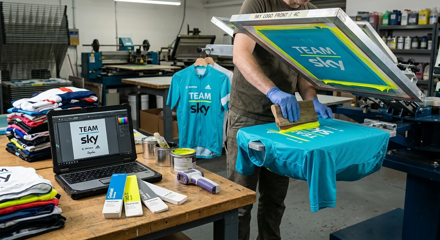
Screen printing isn't the right tool for every cycling kit job. But for the right job, nothing else beats it — not for cost efficiency, color impact, or brand durability at scale.
So where does it win? Think bold sponsor logos on chest panels, team identifiers on sleeves, and high-contrast graphics on non-stretch zones. Match the right ink system with the right fabric. Avoid the common pitfalls covered above. Do that, and you're not just printing a jersey — you're building a kit that represents your team or brand with sharp graphics that hold up through a hundred washes and twice as many hard miles.
Still weighing sublimation vs screen printing for cycling apparel? Start with the decision checklist. Then reach out to a cycling apparel supplier who can look at your specific design, quantity, and fabric combination.
The best custom bike jersey graphics start with the right process. Make sure yours does too.